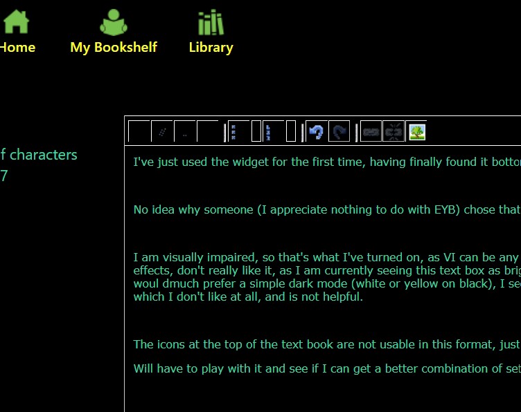
I've just used the widget for the first time, having finally found it bottom left of screen (it's usually top right).
No idea why someone (I appreciate nothing to do with EYB) chose that symbol for accessibility, it seems unrelated to what it does,
I am visually impaired, so that's what I've turned on, as VI can be any one of hundreds of conditions not sure how they selected th effects, don't really like it, as I am currently seeing this text box as bright green on black but tiny characters, which isn't helpful, woul dmuch prefer a simple dark mode (white or yellow on black), I seem to be getting text in different areas in different colours, which I don't like at all, and is not helpful.
The icons at the top of the text book are not usable in this format, just the outlines visible apart from the image pic
Will have to play with it and see if I can get a better combination of settings - I've attempted to post a screensot, which is very difficult as the popups have test in a rainbow of unhelpful colours